Architecture Interview
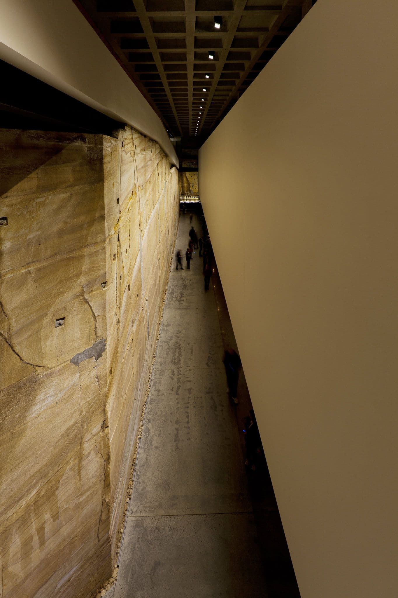
A conversation between Elizabeth Pearce, Mona Senior Writer and Research Curator, and James Pearce, Director of Architecture at Fender Katsalidis.
James was Project Architect for the Mona build. The team was led by Principal Architect Nonda Katsalidis (working in close collaboration with David Walsh), and also included Mona Site Projects Manager Steve Devereaux, among many others.
EP: So I’ve got to write something about the architecture for our website. What aspects do you think people are interested in? Just brainstorm. Go.
JP: Um, okay. It’s built into a rock face… Are you recording?
EP: It’s just for my notes. Go on.
JP: And there is no set way around it. That begins as soon as you get there. If you arrive by jetty you come up those stairs thinking you’ll get somewhere momentous, but then you get to the top and turn around and there’s just this small house.
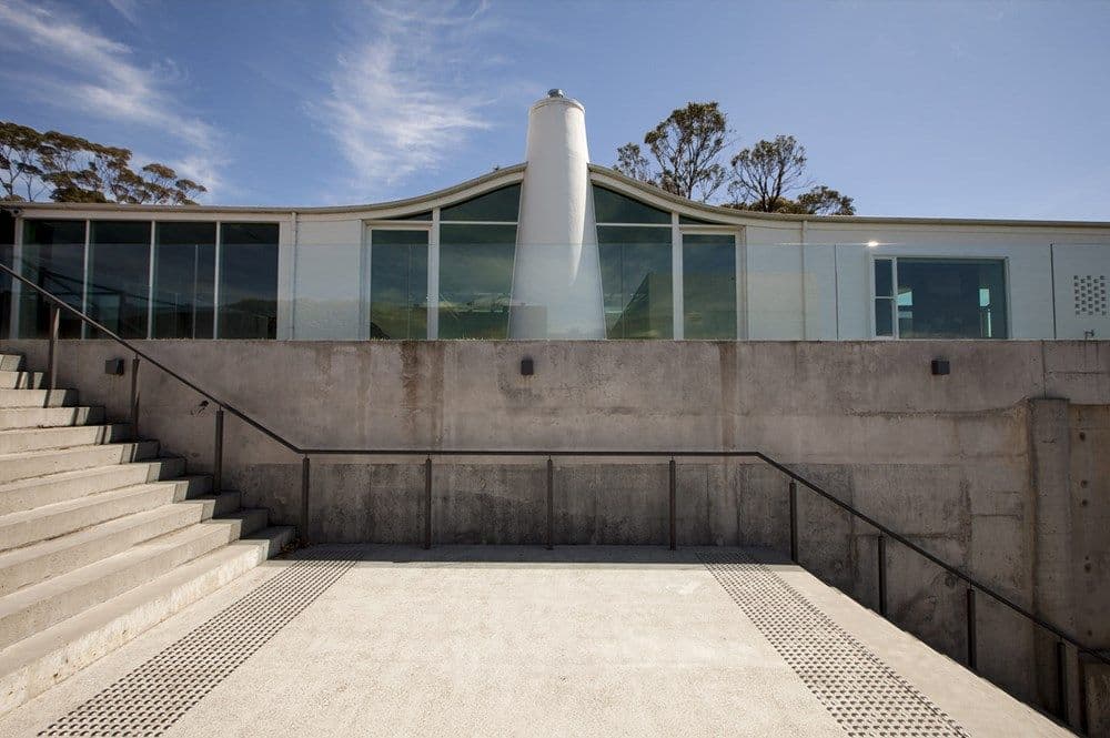
Roy Grounds Courtyard House
Then you go in, and go down a heap more stairs. A big space. ‘Wow, I didn’t know it was going to be so big.’ Still no art.
EP: The arrival was paced to generate a sense of suspense?
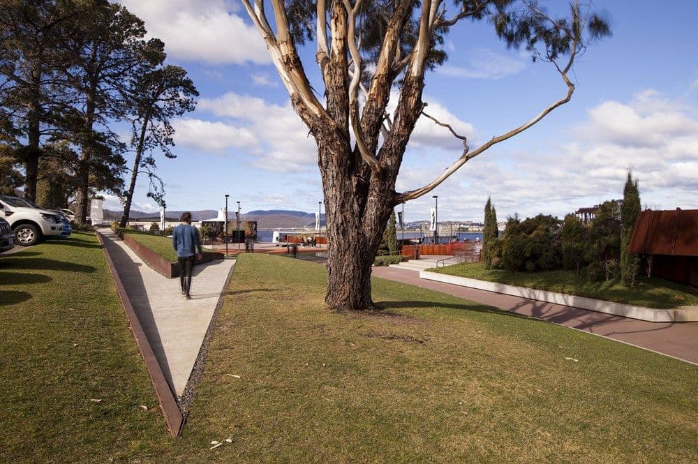
JP: More to clear the mind, and cue you that you are entering into a different kind of world. And from that point, you are on your own—there is no guiding path to follow. That's unlike a traditional gallery, which is a series of rooms that you explore in a particular order. And if you arrive by car—the idea was that eventually, the building would disappear into the side of the hill, with the landscape growing back over the top of it. You’d get there, and you’d go, ‘Oh, I thought this was a big museum. Where is it?’
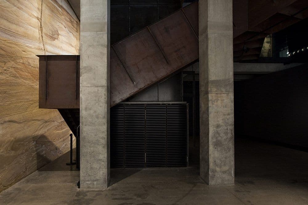
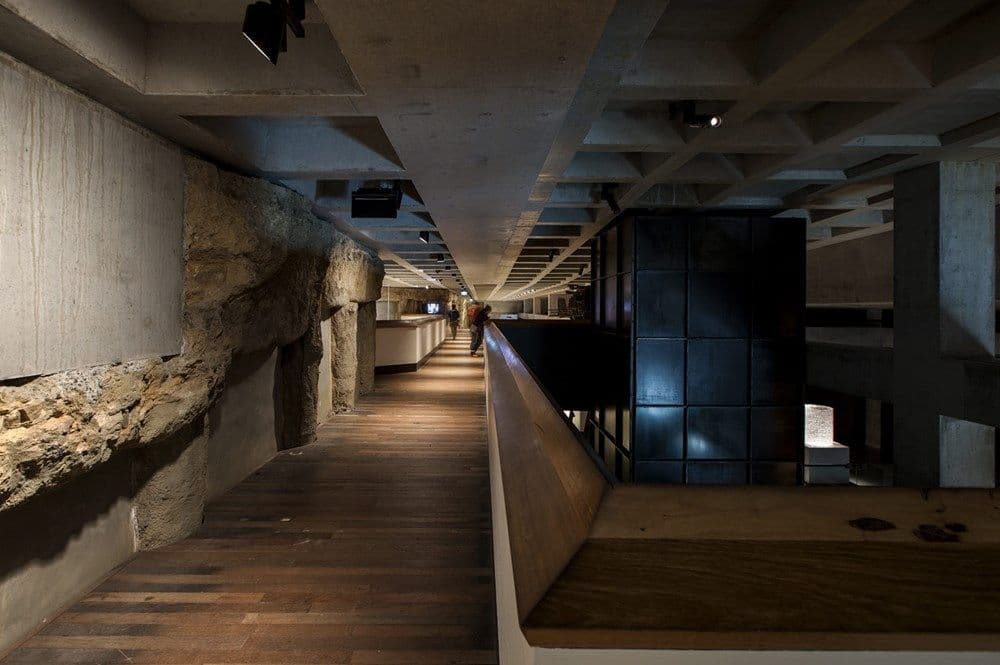
Also, there’re no extraneous finishes. The building is comprised of just what you see. When you get inside, there are no plasterboard linings and stuff like that, just the raw structure.
EP: Is there a particular reason for that?
JP: It gives the building a robustness. It can take a lot of wear and tear, and still look good, not get scuffed or dirty. It also provides a natural character. In most museums you have some sort of expression on the outside, but this is not carried through, so the white box in the interior bears no relation to its structure. We didn’t want to create a neutral space for the art, but an active, living one—a space the art responds to.
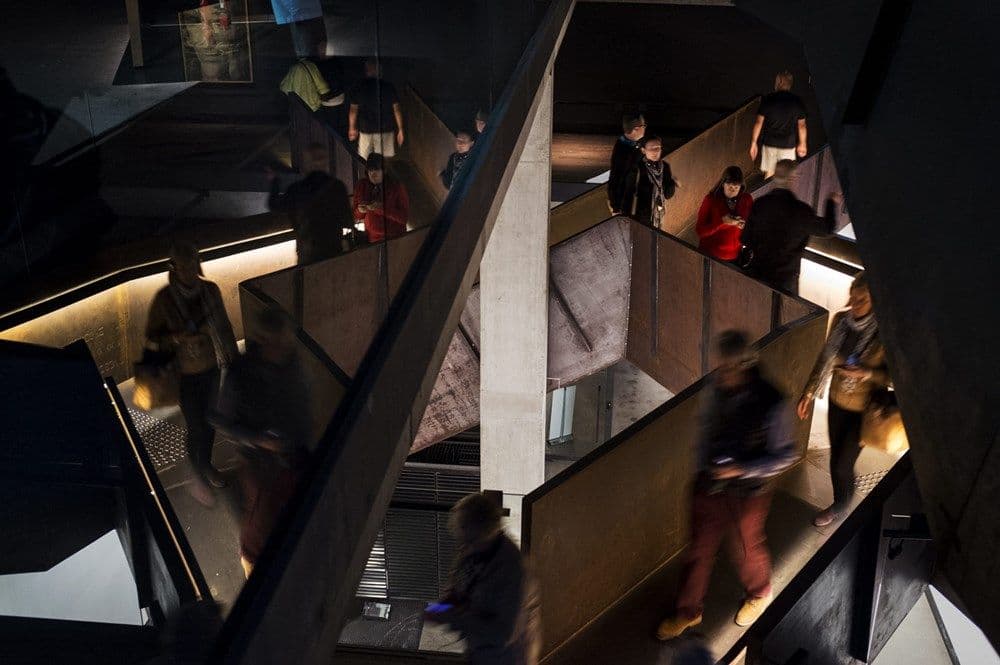
That’s true in another sense as well, because we always planned for the site to grow and change along with its needs. It’s not supposed to be fixed and finished but to adapt, in an architectural sense.
There are significant pieces the museum was built around, such as the Anselm Kiefer work.
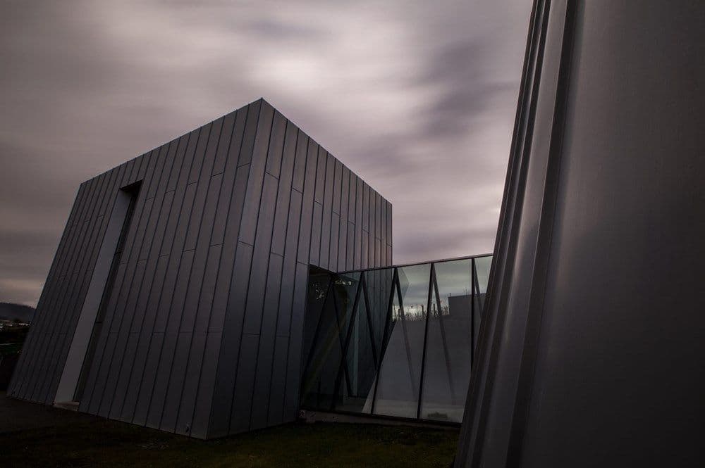
Part of the deal for purchasing the work was that it had a particular space for its display. When Kiefer showed it in Paris, it had its own corrugated iron box. We didn’t want to use corrugated iron, because in Australia that would generate a different set of associations—a comment on vernacular architecture or something. That was not what Kiefer was on about. So we put it in a zinc box, which is a slightly more refined material. Where are the chips?
EP: I hid them. We’re about to have dinner.
JP: David’s original idea was that it should be in the Mona Library, because the work is about storing knowledge—it’s a bookshelf. So his thought was that we should make the library bigger to accommodate it. Then Nonda heard about it and said, ‘No, it should go in the museum, because it is what everyone is going to be coming to see.’ So then David liked the idea of it being in the library even more, because if it’s going to be the thing that everyone comes to see, it should be the hardest thing to find.
EP: What was your approach to the heritage of the existing site?
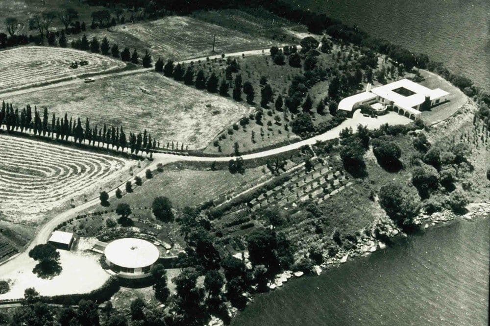
JP: Well, that was part of why David wanted to go underground. The two Roy Grounds buildings should remain prominent, and we would build underneath them. He had this notion that the new structure could join them up somehow.
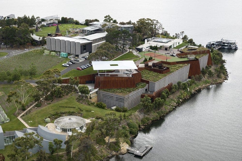
When we started out, our design was nowhere near big enough to bring them together but by the time we finished we were quite close. At the last minute David had the idea to use a tunnel to connect them. But this happened after we had already built the end wall, so a hole had to be cut into it. We were so close already, and David was inspired by Kiefer’s studio in the south of France, where there’s a heap of tunnels and caves, and he thought having one at Mona would be fantastic.
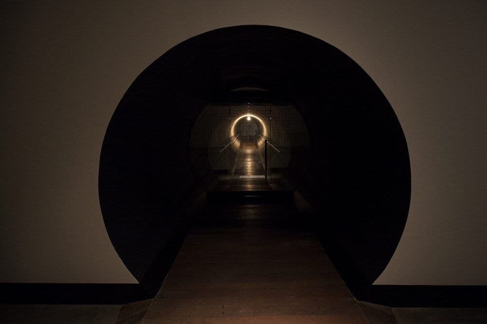
EP: Was the way you dealt with heritage unconventional at all?
JP: No. The standard approach is to be very clear about what is heritage and what is new, and we’ve certainly done that. I guess what is unusual is that by digging under and around both the buildings, we’ve gone to a lot of trouble to still do what we want without disturbing them. But otherwise our approach was pretty standard—apart from the mirrored wall entrance.
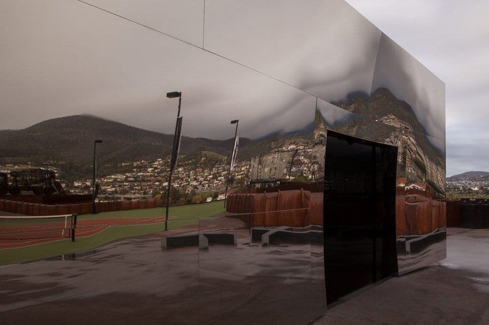
Designed by Matthew Harding
EP: Yeah, how did that come about?
JP: There had been a colonnade on the existing building, that Grounds had originally designed for it. It had been demolished by the time we got there. There was some argument about the fact that we should not reinstate it, but create a new kind of entry piece on the same spot—some sort of statement or marker. The idea behind the mirror entry is about the event horizon surrounding black holes, the point of no return when you can’t escape the pull of gravity.
EP: And why underground? Was it just about heritage?
JP: Probably more importantly, Mona was never meant to be a monumental site, and it was never meant to be about the building. This has sort of—we’ve probably contradicted ourselves there. But we didn’t want to place it on a pedestal like other museums. They impose on you, telling you that you should think like they do, or else you don’t understand. ‘Only the cultural elite can pass beyond this point.’ This undermining effect works when you approach Mona by land—when you arrive by ferry there’s no escaping a sense of the monumental. But that was the reason for going underground.
EP: Were you there when they cut into the cliff face?
JP: Of course!
EP: Was it the greatest moment of your life? At least, before you met me?
JP: No, because it turns out that what we thought would be quite a tricky thing was actually really easy. They just got a big circular saw on the back of a backhoe. It was two metres wide so it cut out a metre deep, and they would just run along the rock, cutting, cutting, cutting, and then they would get a digger with a big ripper at the back, a bulldozer, and rip along and pull all the rock off and get jackhammers and pull it off and then cut it again. You can see the saw marks in the wall, down in the gallery.
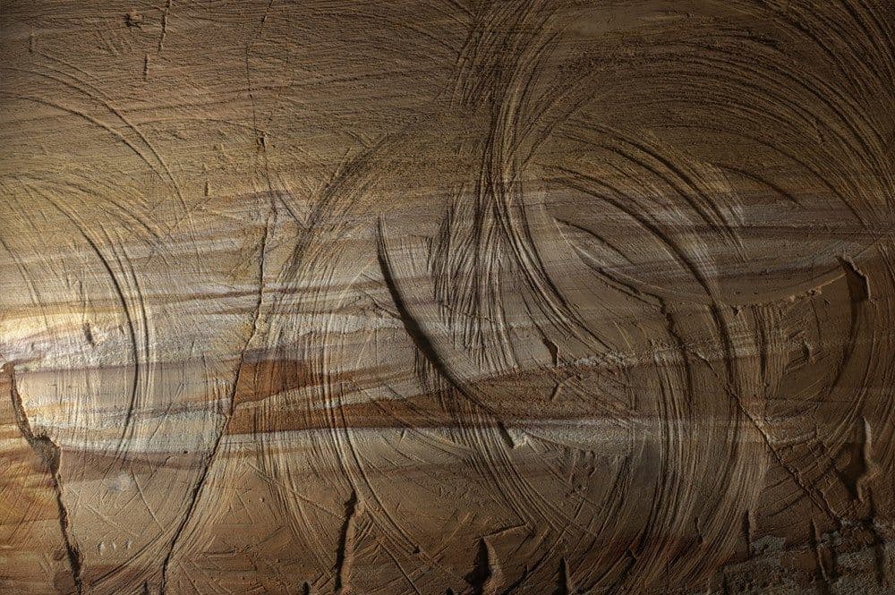
The idea was originally that we’d get huge Stonehenge-type blocks out of it, and David had an artist, Chris Booth, who was going to make a piece out of the rock. But it turned out that the rock came out in pieces ranging from dust, to the size of a basketball, so it wasn’t really worth keeping.
EP: Down in the bottom level of the gallery, that sandstone wall—it sets this mood of damp apprehension I think.
JP: The sandstone reflects sound in a particular way. And a massive rock like that has a certain sense of gravity and presence. A lot of that is to do with the lighting as well. But what’s great about the natural material is it has a variety and life, and you can see all the strata and realise what you’re looking at is hundreds of millions of years old.
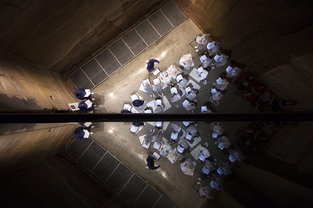
EP: I’ve always wanted to know if there was a particular idea behind the central steel stair—to me it’s like a coiled animal or something, it makes me tense.
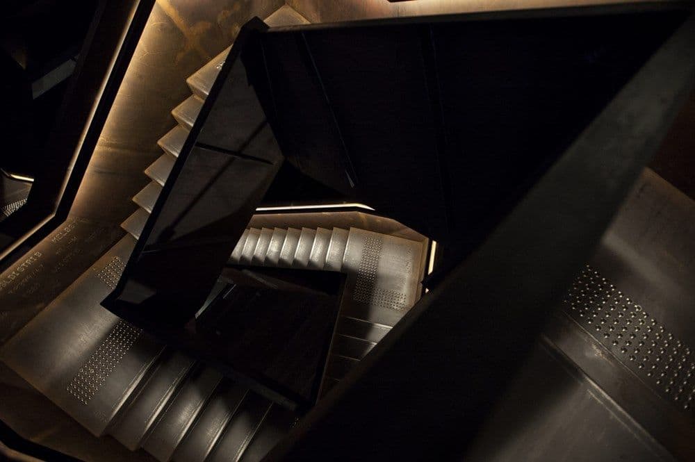
JP: Yes. So—David was always very much against the architects becoming artists. Any time we tried to do something fancy, he was like, ‘If I wanted art, I’d get an artist to do it.’ But we somehow managed to get this stair through. We could explain it to him in a very pragmatic way. We said, ‘David, you don’t want to have columns holding the stair up, because they would interrupt that void space. But you want the stair to connect to each level, and to various points on some levels.’ Sounds logical so far. To do that, we need to make the stair a steel beam, and to make it as cheaply as possible. You don’t want to finish the steel, you don’t want to have to paint it or do anything to it—just as it comes, that’s it. So that was the cheapest possible steel stair we could do.
EP: So his criteria was that if something was arty, it was out? But if you could justify it logically it was okay?
JP: It’s not that we were trying to be artistic, just that when he thought we were getting fancy for the sake of being fancy he would pull us up. Still, it obviously has to be pleasing to the eye. We make aesthetic decisions all the time.
EP: Were there many moments where he did pull you up?
JP: The main one was the bridge that goes from the spiral stair all the way across the Nolan Gallery.
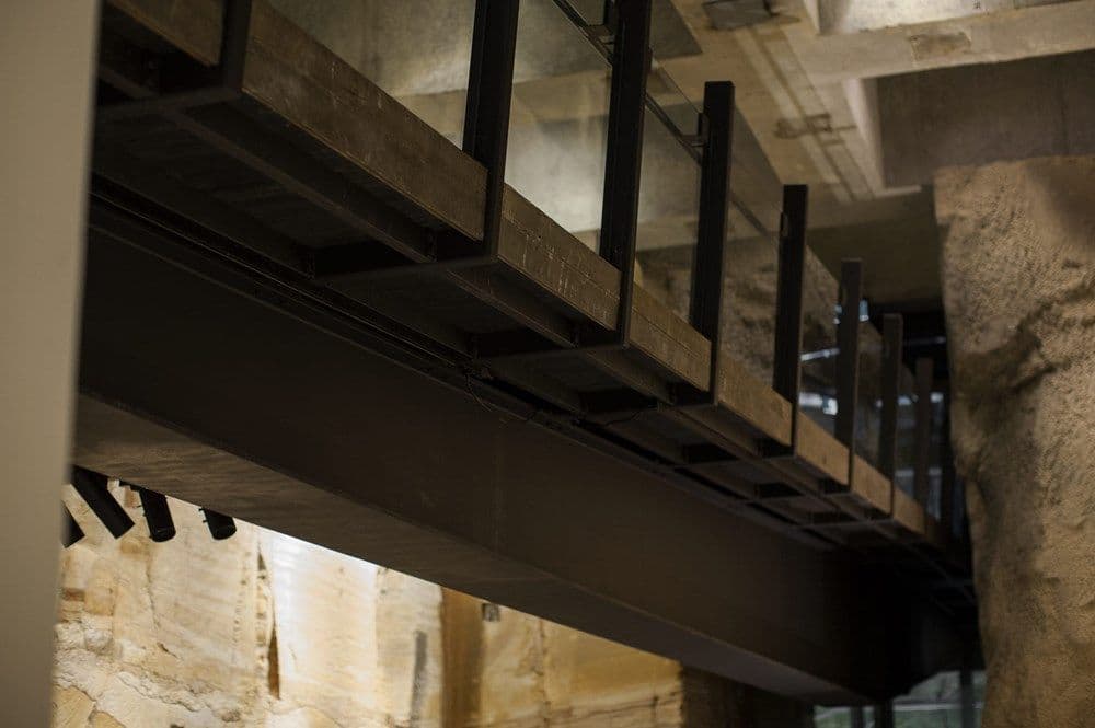
To start off with, we had a space frame truss. He never liked that. He said, ‘It should just be a big, steel beam.’ So that’s what we ended up with. However, I did convince him to—well, whether I convinced him, or whether he just didn’t notice, or saw it and liked it, I don’t know. But we did shape the beam so that it was deeper in the middle and thinner at the ends, otherwise it doesn’t give you a sense that it’s holding something up. This gave it a bit of a dynamic. So we got that one through.
EP: Was there a lot of wrangling with him? Would he and Nonda have big arguments and debates?
JP: Yeah. There were huge arguments about balustrades.
EP: Why?
JP: Nonda was absolutely adamant that there should be no chrome steel handrails with glass balustrades, like you often see. We tried to just continue the walls up and over, rather than introducing another element that acted as a balustrade.
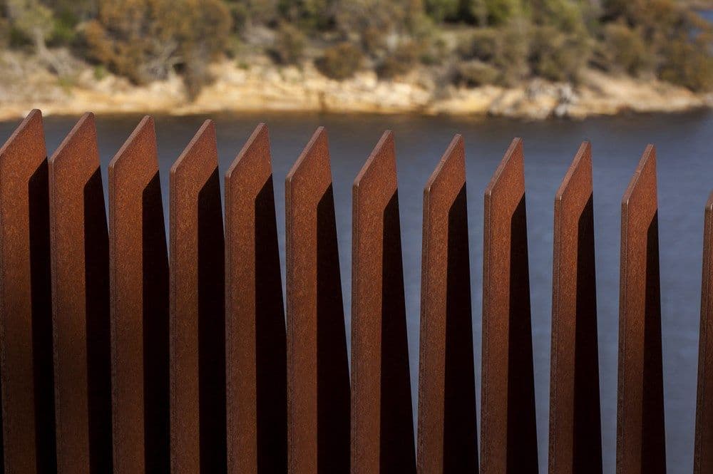
But up on top of the museum, on the plaza, we wanted people to be able to see through, so we solved that problem with the rusted steel blades, shaped to continue the line of the wall. So that was a pretty neat solution.
But we started with a whole lot of other ideas to solve the balustrade problem. Inside the museum, Nonda had this idea of steel rods connecting a steel handrail at the top but the bottom was on a zigzag so the rods sort of wove in and out around the void. David hated it.
EP: Because, again, it was too fussy?
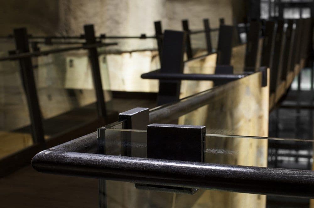
JP: Probably. So we ended up with just the cantilever glass balustrades, which you won’t even have noticed. We avoided the traditional patch-fitting type thing on the balustrade, with the stainless steel dots that you typically see holding up the glass. We invented our own little thing that clips over the glass at the top and then curved out to support it.
EP: There was also a fairly significant falling out about the tennis court on the museum plaza?
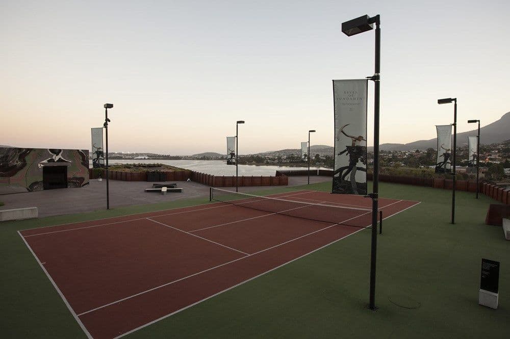
JP: It wasn’t a huge falling out really, but there was definitely a discussion. It came about because of the mirror entry. The idea was that the reflections give you this whole distorted space effect. Nonda came up with the line that it would be good if it reflected the colour green—something like the colour of a tennis court. And David said, ‘I know what’s the colour of a tennis court…’
EP: A tennis court!
JP: But then the conversation moved on. No one paid any attention to it until David rang up a day later and said, ‘James, where’s my tennis court?’ And I said, ‘What?’ and he said, ‘You know, like Nonda suggested in the meeting. Have you worked out whether it will fit?’ We started work on it and Nonda came by. ‘What’s that you’re working on?’ ‘It’s the tennis court you suggested.’
EP: And then you got fired?
JP: Yeah, that’s it. So there was a meeting a week later and Nonda said to David, ‘This is a mistake. People will think you don’t know what you’re doing, like you’re a rich man and you’ve just got all your toys around you—your big gallery, your tennis court. You won’t be taken seriously.’ And David said, ‘Exactly’.
EP: Did you think it was a disaster at the time?
JP: No, I didn’t, no. But Nonda—it was odd. He doesn’t usually think about stuff like that. It’s not that he was being precious about his own design. He was worried about David, about what people would think of him.
EP: Do you think there is anything that you all could have done better?
JP:We always knew that the entry space really wasn’t going to be big enough. People queue up outside and it’s all a bit—and they put tents up to shelter people from the sun, and it’s not ideal.
EP: I don’t think we were expecting queues.
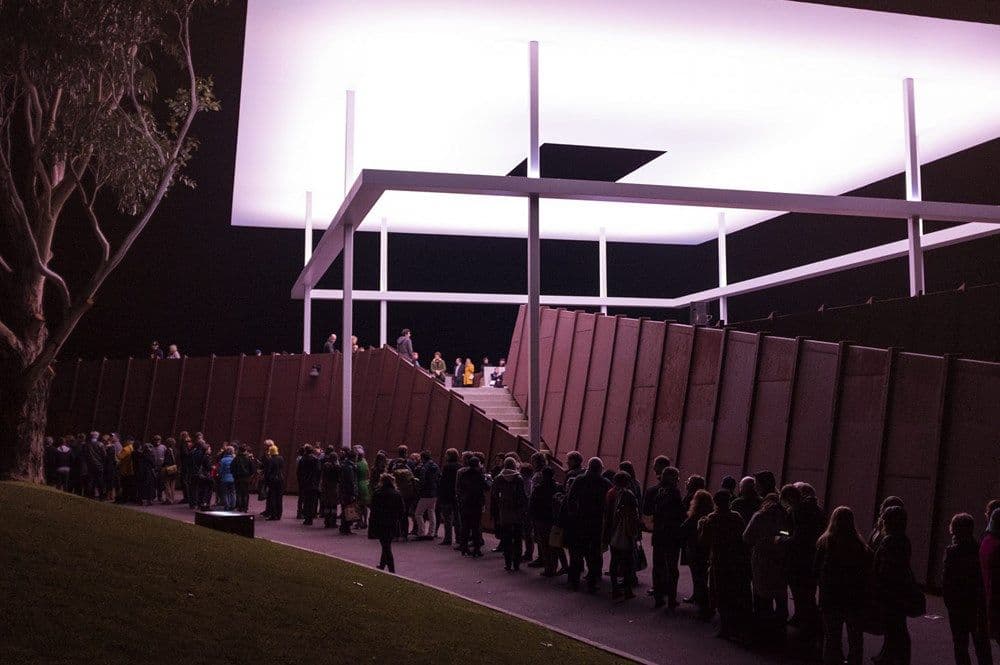
Disclaimer: this actually only happened once
What’s your favourite thing?
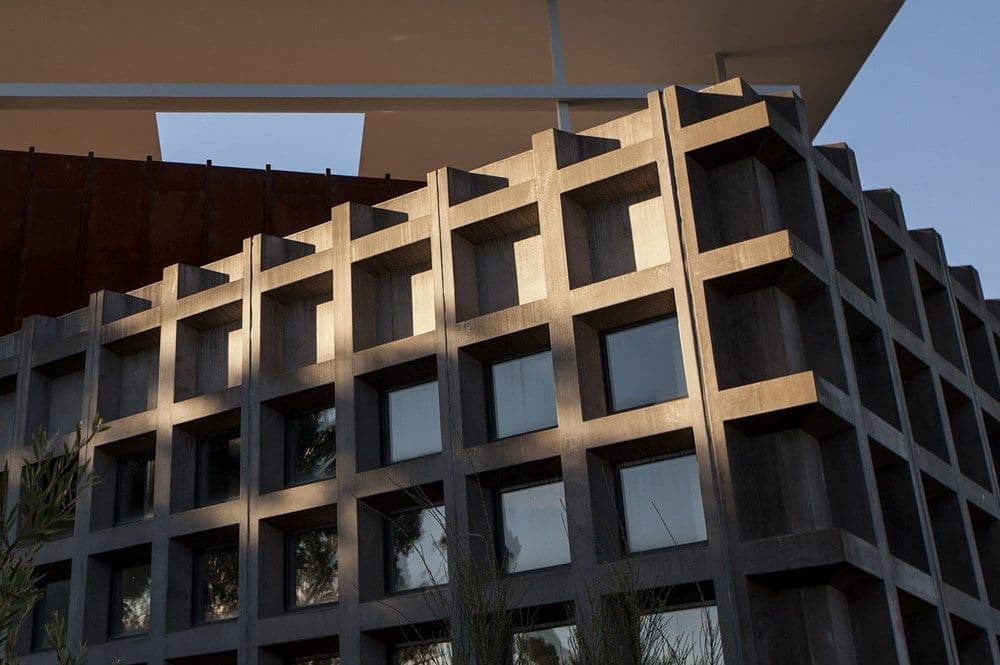
JP: Hmm. The precast concrete wall that wraps around the main gallery space has a grid pattern on it, the same pattern that’s in the ceiling. The important thing for us was that it not look like a whole lot of concrete panels—particularly at the corners. That’s very hard to do, and it’s important, because it’s at the corners that the impression of a three-dimensional object is created. We detailed a panel so it would wrap around the corner, creating a seamless, three-dimensional texture. The grid gets cut off halfway through, at the top and the bottom, so it gives a sense that it just continues.
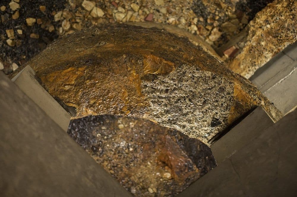
Another funny thing was that there was a lot of discussion about the rocks falling off the rock wall. We got some geologists to do this whole risk assessment about how often something the size of a cricket ball would fall down and how often something the size of a football would fall down. In all that time that these highly paid geologists were fussing about the natural wall, they totally forgot to look at the footings that we had exposed from the old house. The slab of the old house had been poured on a pebble bed and a number of the pebbles had become embedded in the slab. So because people are walking on top of a slab and a slab vibrates, the pebbles fell out. They definitely could have hurt someone. No-one picked this up but we independently thought that actually we should fix that. We ended up spraying the whole lot with a fibreglass gel coat to stick them all up there—that was Steve Devereaux’s idea. He was always like, ‘I’ve got a mate who can do that for us.’
EP: Why do you think David chose Nonda?
JP: It’s in his book. Nonda was selling him his apartment, and David said, ‘I’ll buy it so long as you design me a beach house.’ Because Nonda at that point was saying he wasn’t doing architecture anymore. Nonda wanted to sell the apartment so he agreed to design the beach house. The museum grew from there.
EP: They’re a good fit really.
JP: Can we eat?
EP: Yes, unless you’ve got anything interesting to say?
JP: Have I said anything interesting all night?
EP: We’ll see.